
How to Easily Add a Mobile Responsive Menu in Blogger
What is Responsive Menu?
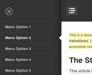
Responsive menus are such navigation menus, which are flexible and user-friendly at the very same time. They provide a quality experience for both desktop users to mobile users. When on the desktop they appear the traditional way, but on mobile they appear just like a mobile application width, height and well arranged. In the following screenshot, you can clearly see the same menu appearing different on the desktop and on a smartphone.Live preview of this menu can be seen at this site http://moviezees.blogspot.com/

How to easily add a Responsive menu in Blogger?
When it comes to creating a responsive menu in blogger we have a variety of techniques on how to we can handle our navigation menus for small screen devices like mobile phones, smartphones and etc. The resources we have got to achieve this goal are endless. In this article, we will show a main concept that is easier to implement and have more advantages than disadvantages.The very first thing you need to do is to go to Blogger.com > Template > Edit HTML and paste the following code anywhere after <body> tag. (Keep in mind paste this code exactly where you would like to your menu to appear).
<!---Menu--> <nav id='nav-main'>
<ul>
<li><a href=''>Home</a></li>
<li><a href=''>About</a></li>
<li><a href=''>Gallery</a></li>
<li><a href=''>Tutorials</a></li>
<li><a href=''>Contact</a></li>
</ul>
</nav>
<div id='nav-trigger'>
<span>Menu <i class='fa fa-list'/></span>
</div>
<nav id='nav-mobile'/>
Now you to style the menu, you need to add the CSS to your template. To do so again in the template, search for }}]]></b:skin> tag and just below it paste the following code
#nav-trigger {
display: none;
text-align: center;
}
#nav-trigger span {
display: block;
background-color: #279CEB;
cursor: pointer;
text-transform: uppercase;
padding: 0 25px;
color: #EEE;
line-height: 67px;
}
nav#nav-mobile {
margin: 0px;
}
nav {
margin-bottom: 30px;
}
nav#nav-main {
background-color: #279CEB;
margin: 0px;
float: left;
}
nav#nav-main ul {
list-style-type: none;
margin: 0;
padding: 0;
text-align: center;
}
nav#nav-main li {
display: inline-block;
float: left;
ont-family: 'Open Sans', sans-serif;
}
nav#nav-main li:last-child {
border-right: none;
}
nav#nav-main a {
padding: 0 25px;
color: #EEE;
line-height: 67px;
display: block;
}
nav#nav-main a:hover {
background-color: #3AB0FF;
text-decoration: none;
color: #fff;
}
nav#nav-mobile {
position: relatifve;
display: none;
}
nav#nav-mobile ul {
display: none;
list-style-type: none;
position: absolute;
left: 0;
right: 0;
margin-left: auto;
margin-right: auto;
text-align: center;
background-color: #ddf0f9;
z-index: 10;
padding: 0px;
border-bottom: solid 1px #cc0028;
}
nav#nav-mobile li:last-child {
border-bottom: none;
}
nav#nav-mobile a {
display: block;
color: #29a7e1;
padding: 10px 30px;
text-decoration: none;
border-bottom: 1px solid #00aeef;
}
nav#nav-mobile a:hover {
background-color: #e6002d;
color: #fff;
}
/* =Media Queries
-------------------------------------------------------------- */
@media all and (max-width: 900px) {
#nav-trigger {
display: block;
}
nav#nav-main {
display: none;
}
nav#nav-mobile {
display: block;
}
}
After adding HTML and CSS core coding, without adding the following JavaScript code the menu would not work correctly. Therefore, add the following code just above the </head> tag.
<script type='text/javascript'>
//<![CDATA[
$(document).ready(function(){
$("#nav-mobile").html($("#nav-main").html());
$("#nav-trigger span").click(function(){
if ($("nav#nav-mobile ul").hasClass("expanded")) {
$("nav#nav-mobile ul.expanded").removeClass("expanded").slideUp(250);
$(this).removeClass("open");
} else {
$("nav#nav-mobile ul").addClass("expanded").slideDown(250);
$(this).addClass("open");
}
});
});
//]]>
</script>
We hope this tutorial will help everyone in learning how to easily add a responsive menu in blogger without facing much of worries. If you like this article, do share it with your friends.


0 comments:
Post a Comment