Hot Reads

Tuesday, 15 November 2016

How To Get Google News RSS Feed

Using RSS feeds of Google News, you can get easier access to updates about news topics that interest you. When you subscribe to a Google News feed using a feed reader, you'll receive a regularly updated summary of relevant news articles along with links to the full articles.

You can use and subscribe to both Google News section feeds and search results feeds.

You can find Google News Feeds by searching for the orange RSS icon at the bottom of any Google News page.


By clicking this RSS icon, you can get a feed for any Google News section.

For instance, while you're on the Business page, clicking the RSS icon at the bottom of the page will give you a feed of business news.

You can also get a feed for searches you do on Google News. First perform a search on Google News, then simply use the RSS icon at the bottom of the search results page to generate the feed.

I like Google News because it’s an easy way to see news articles from newspapers worldwide, grouped by topic and also grouped with similar headlines. As a blogger, you can use it to source for content for your blog.

Do you use Google News?

Want To Earn Money On Fiverr? Avoid These 6 Mistakes

It is perhaps not going to be surprising to know that Fiverr is an online market place that has raised countless number of Internet millionaires.

Ordinarily, the mere thought of offering your skill as a service for $5 may seem discouraging but the truth is that; most of us don't even accept $5 deals yet there are others begging and wishing for those $5 deals.

Your curiosity should be what the difference between these two categories of "Fiverrians" is. It all depends on the level of professionalism applied. But I won't want to go into that right now because the aim of this post is to identify some mistakes people make with Fiverr and consequently earn nothing.

Ready to kill it? Let's dig it!


1. Not seeing Fiverr as a business

This is the biggest error anyone could make. Though fiverr may seem like a personal stuff (like where the title of a gig normally begins with "I WILL...") but in the core reality of it, Fiverr is a serious business.

To make good money on fiverr you must treat your fiverr profile the way you treat your business.

You must talk to your buyers like an experienced customer care rep when they message you instead of talking to them as if you are chatting with your Facebook friends. You must use formal tones and correct spellings so as to keep your buyers coming back.


2. Promising what you can't deliver

A perfect instance where people err on this is in terms of DELIVERY TIME.

Fiverr would never penalize you for setting 10 days as your delivery time for a simple flier design (provided your buyers are cool with it). But setting 24 hours as your delivery time and eventually delivering latter than that will affect your rating.

This explains why you would hear people say "I was getting orders but it suddenly stopped."


3. Being too scared of your buyers

I have said that Fiverr should be seen as a business. And ordinarily, you shouldn't be afraid of your customers as to letting them abuse your business. Be free to let them know your terms of service. And don't sound like a desperate seller.


4. Making silly mistakes

Fact is ; Nigerians and citizens of other countries are creating their fiverr accounts under the US flag.

If you don't then you may not make much sales (at least from my experience). However, some sellers tend to forget what they have done and would respond wrongly to buyers especially if it involves making excuses.

Take for example a situation where you were unable to deliver an order on time and went ahead to tell your buyer (perhaps from USA) that you couldn't deliver on time because you didn't have light for days or due to poor network in your village. That's funny but some do that...lol

Another error under this point would be not sounding like a native of bilingual as stated in your profile. Your buyers would be quick to notice that. So study their speech or writing pattern.


5. Staying offline

I have always told my students that a major key for success on Fiverr is staying online at the right moment. No matter how professional you may think you are, buyers often send messages to those who are online.

Each time I have less orders on queue I get new orders by simply logging in and doing other stuff on a separate tab.


6. Setting security questions

If you are going to be faking your profile then I recommend you skip Fiverr's security question. That feature may look useful but it's actually a trap.

If fiverr noticed a mix up in your IP address (perhaps because you forgot to switch on your VPN) they would most probably reset the answer to your security question. The aim is to make you contact customer support and when you do, they would request your true identity. By then, deportation is sure.lol

It's my hope that these tips would help you thrive in your fiverr business. So let's go killing guys!

Any addition or subtraction?

How To Make Blogger Mobile Pagelist Drop Down Menu Display Like Webview

Blogger default templates on mobile must surely give you a drop down menu pagelist.

This has really made it difficult sometimes for visitors to find your contact page, except they scroll down to the footer if you have added the contact link there.

Google Adsense is another important thing to consider, placing ads below a drop down navigation is a violation of Adsense policy. Therefore, of recent many ads below that spot on blogger mobile view were force to the bottom.

Well, you can eliminate the drop down pagelist on mobile view and let it display the same way it appears on webview. This tutorial will guide you on how to do so.


remove dropdown menu on blogspot mobile view


no mobile menu blogger web design


How To Get Started

Before you get started, please, BACK UP YOUR TEMPLATE so you can easily reverse should in case you mess up your blog's code.


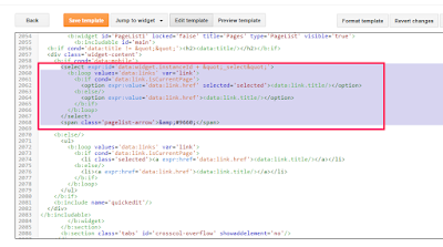
==> Go to "Template" > 'Edit HTML' and search for <b:widget id='PageList1'. Alternatively, you can use the "Jump To Template" option to easily navigate to the PageList1 widget code.


==> Scroll down and look for the following codes :

<select expr:id='data:widget.instanceId + &quot;_select&quot;'>
<b:loop values='data:links' var='link'>
<b:if cond='data:link.isCurrentPage'>
<option expr:value='data:link.href' selected='selected'><data:link.title/></option>
<b:else/>
<option expr:value='data:link.href'><data:link.title/></option>
</b:if>
</b:loop>
</select>
<span class='pagelist-arrow'>&amp;#9660;</span>


pagelist widget code blogspot design


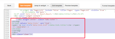
==> Once you find the above codes, replace them with the codes below:

<div align='center' class='tabs-outer'>
<strong>
<b:loop values='data:links' var='link'>
<span> <a expr:href='data:link.href'><data:link.title/></a> </span>
<!--separator-->
</b:loop>
</strong>
</div>
<div class='clear'/>


pagelist code blog design


==> Click "Save Template"
==> Go to "Template" > "Customize" > "Advanced" > "Add CSS"
==> Copy and paste the code below, in the "Add CSS" box 
.mobile .tabs-outer {  
color: #333; 
text-align:center; 
width:auto; 
overflow:hidden; 
margin:0; 
padding:0px 0px 0px 0px;
.mobile .tabs-outer span a { 
color: #fff; 
padding:0 7px;
margin:0;
}
.mobile .tabs-outer span a:hover {
text-decoration:none;
color: #fff;
font-size:1.0em;
padding:0 5px;
margin:0;
}
==> Click "Apply To Blog"
That's all.
View your blog on mobile and you should see that the dropdown menu displaying as it does on web view. 
What's your take on this?.

Monday, 5 October 2015

10 Tricks to Boost Adsense Earnings; Increasing CPC & CTR

After getting the Google Adsense account approved, the thought that comes to the mind of every blogger is ‘how to optimize adsense ads?’.  After adsense ads starts displaying on our sites, we feel that we have done everything. But, many of them will have CPC of  just 1 to 30 cents. But, if you can optimize the adsense units effectively, you can increase your CPC from mere cents to several dollars.
Adsense Optimization

Adsense Optimization techniques for higher CPC and CTR

1. Change adsense ad layouts to find out which one best suits your site. A placement strategy which works well in one site need not work better in another. So, don’t worry. Just change the ad placement and watch the change in adsense earnings.
2. Use maximum number of available ads(3 standard ad units image/text, 3 link units and search bar) possibly in most of the pages. But, you should do it carefully such that the user should never get a feeling that the site is full of ads.
3. Use more standard text ad units as it gives higher CPC than image ads.
4. Implement highest paying ad sizes(Large Rectangle-336×280, Leaderboard-728×90, Medium Rectangle -300×250 and Wide Skyscraper -160×600).
5. Try different ad layouts in each post. That is, in case of a 300×250 ad unit, if it is placed at the begining of a post, just push it to last in the next post and so on.
6. Change the ad colour in link ad units and text ads(colour used for hyperlink usually give better results).
7. Ad Targeting: If you are using the same ad unit in all pages(eg 728×90 ad), target the ad. It will increase the Cost Per Click(CPC) of that ad unit. For that open adsense homepage. Click on ‘My ads’ tab. Go to ‘Custom channels’. Click on ‘New custom channel’. From there select the ad unit, give a name and tick on Targeting and fill the boxes below. Now, it’s all done. Analyse the changes in earnings in a week or two.
8. Switch to responsive WordPress themes. Since mobile and tablet users are increasing day by day, responsive themes play a crucial role for more traffic and for getting more adsense earnings.
9. Don’t place all the 3 ad units above the fold. This can decrease your adsense CPC.  It is true that you can get more clicks by placing ads at the beginning. But, from my experience it will lower your adsense CPC. Another advantage of this policy is that you can increase your site speed. Lowering Javascript above fold will decrease the page load time and is good for SEO as well.
10. Use responsive adsense ad units. Responsive adsense units are ads that are capable of changing their size according to the maximum available area where the unit is placed. For example, if you have a sidebar 400px in width and you have placed a responsive ad unit there. The ad unit will display 300*600 or 360*280 or 300*250 or other automatically. Moving to responsive ad units will dramatically increase adsense earnings(cpc and clicks) from tablets and Smart phones. I gave these units a try and found it great. But, moving all the  ad units to responsive mode is not a good idea. The only condition you should follow is that never place a responsive ad unit before title. Since when viewed from mobile platform, it will show large ads which is against Adsense TOS(Content should be served first).
Above all this, try to visualize your site as a user visiting the same, and try to exploit the chances so that you get more clicks.(Place ads where they would surely notice). This will surely increase your CTR.
Now, this is my word for you.
“Never get carried away by the success stories of fellow bloggers and website owners. Every one will have their time. Just do experiments on your ad arrangements, wait and see whether it works(say for 3 to 4 days or a week). If it fails, try another. Surely you will see a boost in your adsense earnings soon.”

Google Adsense Approval Trick – 10 steps

Google adsense being the giant in online advertising, it’s the dream of every blogger or website owner to get his/her adsense account approved. There are certain conditions you have to check regarding your wesite or blog before you apply for adsense approval. Bloggers from USA, Canada and Europe gets adsense approval quickly compared to asians(india,china,.).
Google AdSense approval trick
Google AdSense Approval

Google Adsense Basic Requirements

  1. Your website or blog should be at least 6 months old.(newly blogs only from Europe, USA, Canada are accepted).
  2. Your site should not contain any adult content.
  3. Your site should not contain any copyrighted pictures, videos or links to sites that violate google policies and guidelines.
  4. Never copy and paste content from other websites. Always post new original content.write content rich pages.
  5. You should post at least 10 to 20 content rich pages before applying.
  6. You must be at least 18 years old.
  7. Your site should have a good navigation system that can link all the pages of the blog from the homepage.
  8. Include an about author page with your original photo.
  9. Copyright your content.You can signup in myfreecopyright to copyright your contents for free.
  10. Get some daily visitors through google search.I think the page views are not given much consideration.The content is all.

THE TRICK THAT WORKED FOR ME
I applied for adsense soon after my blogspot hosted blog became 6 months old. At first,I got many issues which led to the application rejection.It includes the page navigation difficulty,about author page,etc.Each and every time,before sending the next application I tried my level best,so that the issues were not observed the next time.After 5 or 6 times,I was wondering that “page type” issue was observed,which I was unable to fix after many applications.
Also,I heard that applying for adsense many times in quick time will have bad effect. After applying many times,really I got depressed. But,I got an idea of making my blogspot blog account into a website. For that I bought a domain through Bigrock. At that time there was no internet banking facility available for asians in Godaddy. But now it is available for most of the website registrars including Godaddy and Bigrock. You can get discount of 35% and more on your purchase by applying coupon codes. Now,you have two options. The first is to buy hosting plans. For a new blogger it will be difficult to pay that much amount. The second and the easiest is to redirect the blogger account to the new site. After making sure that your site is working properly, reapply for adsense. If any new problems are detected, just resolve them and apply again. Most probably, you will get your adsense account approved.
Update(19/09/2014)
It’s almost 2 years since I got my Adsense approval. All I can say is “Adsense is the best CPC network for bloggers”. Those days, the websites were a little bit low, and I should say it was easy to get approval. Today, the scenario has changed completely. It’s becoming hard and harder to get an Adsense account approved. It does not mean I am discouraging you. I am just reminding you that the competition has become little tough. Below, there are some tips and tricks that can guide you to get Adsense approval

Google adsense approval
Google Adsense approval
  • Fulfill all the 10 basic requirements that are listed above.
  •  Concentrate your writing to a specific category. This will help you get more traffic and will be a plus point while applying for Adsense.
  • “Content is King”, it really is. Write quality posts with more words. Try to explain more and include more images. Don’t concentrate on keywords. If you post original content, you will surely get good traffic automatically from search engines.
  • Check for Adsense approved websites in your category. This is because, Google does not accept all categories. Approval for some categories are easy(Medicine, Health, etc). Whereas for others it’s bit difficult. Also I heard that some friends running Banking related websites and job portals, always got bad luck even with good organic traffic and content.
  • Get some decent traffic from Google search.
  • Apply for Adsense only after 6 months. During this time, try to create more content, get some more organic traffic, try applying various SEO strategies and try to create more SEO friendly webpages.
  • Submit urls and sitemaps to Google by using Google webmaster tools and analyse your website performance using Google Analytics.
  • Remove all ads running on your site before applying for Google Adsense. It’s very important.
  • Remove links that are directed to websites that does not comply with Google guidelines. Eg: A free software download link to an external website.
  • I have not tried getting adsense approval using YouTube. Only know that the Adsense approved account(for a website) can be used to monetize a video that is uploaded from the same account. That is, you need not apply separately for video ads approval. Vice versa can also be true. The method suggests, uploading 2 or 3 new original videos to youtube and applying for Monetization program from there. I don’t think it’s an easy idea to create a video. If anybody tried this, you can confirm it here.

Ads that work with Google Adsense

As the approval of Google Adsense account takes minimum of 6 months and the chances of getting approved for the very first time is difficult, you can try Adsense compatible ads to run on your site. One of the ads that comply with all Google’s policies and TOS is Infolinks. Infolinks is basically an intext advertising company. Means that, it display ads when someone move the mouse pointer over words highlighted by infolinks. You get paid when someone views or clicks the ad. The good thing about infolinks is that, the publisher approval is very easy. With 2 or 3 posts and even with a new domain, you get instant approval. The earnings are not very high compared to Adsense. But, Infolinks is the best intext advertising network for bloggers.
There are other ad formats supported by Infolinks other than intext. ‘Infold’ which displays on bottom when you get a visitor through organic search, ‘intag’ which displays related keywords at the end of the post, ‘inframe’ which floats on both sides which is a full screen ad on entrance or exit. Turning all the units active will increase your earnings quickly.
Setting up Infolinks is very easy. It has codes for every platform- WordPress, blogger, Joomla or whatever. Infolinks wordpress plugin makes the installation and settings easier on WordPress. From the infolinks publisher center, you can customize the ads displayed on each and every website. Infolinks has various payment options viz PayPal, Bank Wire, eCheck, Western Union, ACH (only for U.S. bank accounts) and Payoneer. The minimum payment threshold is $50.
I used infolinks along with Google Adsense and encountered no issues. I got paid and i can assure you that it is legit. You can signup using the below link.


Wednesday, 17 June 2015

How to Easily Add a Mobile Responsive Menu in Blogger

Menus or better known as navigation menus are extremely useful for providing a user-friendly environment to your visitors. Menus enable your visitors to look for the exact content they are looking for by going through specific categories. However, now day’s menus have changed into Responsive menu providing flexibility for mobile users to navigate through your site with ease. In case you’re looking to add a mobile, responsive menu to your blogger blog then you are fortunate to be at the right place. Today in this article, we will show you how to easily add a mobile responsive menu in blogger.

What is Responsive Menu?

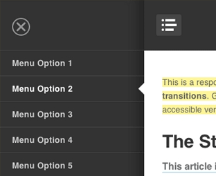
Responsive menus are such navigation menus, which are flexible and user-friendly at the very same time. They provide a quality experience for both desktop users to mobile users. When on the desktop they appear the traditional way, but on mobile they appear just like a mobile application width, height and well arranged. In the following screenshot, you can clearly see the same menu appearing different on the desktop and on a smartphone.

Live preview of this menu can be seen at this site http://moviezees.blogspot.com/

How to easily add a Responsive menu in Blogger?

When it comes to creating a responsive menu in blogger we have a variety of techniques on how to we can handle our navigation menus for small screen devices like mobile phones, smartphones and etc. The resources we have got to achieve this goal are endless. In this article, we will show a main concept that is easier to implement and have more advantages than disadvantages.

The very first thing you need to do is to go to Blogger.com > Template > Edit HTML and paste the following code anywhere after <body> tag. (Keep in mind paste this code exactly where you would like to your menu to appear).

<!---Menu--> <nav id='nav-main'>
    <ul>
        <li><a href=''>Home</a></li>
        <li><a href=''>About</a></li>
        <li><a href=''>Gallery</a></li>
        <li><a href=''>Tutorials</a></li>
        <li><a href=''>Contact</a></li>
    </ul>
</nav>
<div id='nav-trigger'>
    <span>Menu <i class='fa fa-list'/></span>
</div>
<nav id='nav-mobile'/>
Now you to style the menu, you need to add the CSS to your template. To do so again in the template, search for }}]]></b:skin> tag and just below it paste the following code
#nav-trigger {
    display: none;
    text-align: center;
}
#nav-trigger span {
    display: block;
    background-color: #279CEB;
    cursor: pointer;
    text-transform: uppercase;
    padding: 0 25px;
    color: #EEE;
    line-height: 67px;
}
nav#nav-mobile {
    margin: 0px;
}
nav {
    margin-bottom: 30px;
}
nav#nav-main {
    background-color: #279CEB;
    margin: 0px;
    float: left;
}
nav#nav-main ul {
    list-style-type: none;
    margin: 0;
    padding: 0;
    text-align: center;
}
nav#nav-main li {
    display: inline-block;
    float: left;
    ont-family: 'Open Sans', sans-serif;
}
nav#nav-main li:last-child {
    border-right: none;
}
nav#nav-main a {
    padding: 0 25px;
    color: #EEE;
    line-height: 67px;
    display: block;
}
nav#nav-main a:hover {
    background-color: #3AB0FF;
    text-decoration: none;
    color: #fff;
}
nav#nav-mobile {
    position: relatifve;
    display: none;
}
nav#nav-mobile ul {
    display: none;
    list-style-type: none;
    position: absolute;
    left: 0;
    right: 0;
    margin-left: auto;
    margin-right: auto;
    text-align: center;
    background-color: #ddf0f9;
    z-index: 10;
    padding: 0px;
    border-bottom: solid 1px #cc0028;
}
nav#nav-mobile li:last-child {
border-bottom: none;
}
nav#nav-mobile a {
display: block;
color: #29a7e1;
padding: 10px 30px;
text-decoration: none;
border-bottom: 1px solid #00aeef;
}
nav#nav-mobile a:hover {
background-color: #e6002d;
color: #fff;
}
/* =Media Queries
-------------------------------------------------------------- */
@media all and (max-width: 900px) {
#nav-trigger {
    display: block;
}
nav#nav-main {
    display: none;
}
nav#nav-mobile {
    display: block;
}
}

After adding HTML and CSS core coding, without adding the following JavaScript code the menu would not work correctly. Therefore, add the following code just above the </head> tag.

<script type='text/javascript'>
//<![CDATA[
$(document).ready(function(){
    $("#nav-mobile").html($("#nav-main").html());
    $("#nav-trigger span").click(function(){
        if ($("nav#nav-mobile ul").hasClass("expanded")) {
            $("nav#nav-mobile ul.expanded").removeClass("expanded").slideUp(250);
            $(this).removeClass("open");
        } else {
            $("nav#nav-mobile ul").addClass("expanded").slideDown(250);
            $(this).addClass("open");
        }
    });
});
//]]>
</script>
Once you are done adding the above three codes in your template, save it by pressing "Save Template". Congratulations, you have successfully added mobile responsive menu in blogger. Now go and test your site from desktop and mobile to experience the difference.

We hope this tutorial will help everyone in learning how to easily add a responsive menu in blogger without facing much of worries. If you like this article, do share it with your friends.

How to Display Random Posts in Blogger

Since your blog is more like a diary or because of its natural structure sometimes old articles gets neglected and hardly gets any visitors directly from your website. New users joins your website, takes complete benefit from it but never bother to visit your old good articles. However, a simple way to bring back attention to your old articles is to display them somewhere in your sidebar. Today in this article, we will show you how to display random posts in blogger.

What is Random Posts Widget?

This widget displays a list of random posts from your blog providing the ability to your visitors to read your good articles from the paste. On the other hand, this widget is probably ideal for bringing back limelight to some of your posts that are buried in your blog achieve. Before, you add this widget in your blog check out the screenshot below of this widget:

How to display Random Posts in Blogger?

This tutorial consists of two parts, in the first one we’ll be adding CSS of the widget and in the other half we will add the main structure coding on the widget. So, the very first thing you need to do is to login into your blogger account and go to Template >> Edit HTML. Now in the blogger template editor, search for ]]></b:skin> tag and just above it paste the following code.


ul#random-posts img {
    float: left;
    margin-right: 10px;
    margin-bottom: 20px;
}
ul#random-posts li {
    border-bottom: 1px solid #d2d2d2;
    padding-bottom: 10px;
    margin-bottom: 10px;
}
.rp-info {
    font-style: italic;
}
.rp-snippet {
    font-style: normal;
}
ul#random-posts a {
    font-weight: bold;
}

Till here, you have successfully installed CSS codes to your template, now it’s time to add main structure coding. It depends on you, where you would like to display random posts on your blog but popular blogs always recommends adding it in your sidebar. So, go to Layouts >> Add a Gadget >> Add HTML/JavaScript >> just paste the below coding in the HTML box.


<ul id='random-posts'>
<script type='text/javaScript'>
var rdp_numposts=5;
var rdp_snippet_length=80;
var rdp_info='yes';
var rdp_comment='Comments';
var rdp_disable='Comments Disabled';
var rdp_current=[];var rdp_total_posts=0;var rdp_current=new Array(rdp_numposts);function totalposts(json){rdp_total_posts=json.feed.openSearch$totalResults.$t}document.write('<script type=\"text/javascript\" src=\"/feeds/posts/default?alt=json-in-script&max-results=0&callback=totalposts\"><\/script>');function getvalue(){for(var i=0;i<rdp_numposts;i++){var found=false;var rndValue=get_random();for(var j=0;j<rdp_current.length;j++){if(rdp_current[j]==rndValue){found=true;break}};if(found){i--}else{rdp_current[i]=rndValue}}};function get_random(){var ranNum=1+Math.round(Math.random()*(rdp_total_posts-1));return ranNum};
</script>
<script type='text/javaScript'>
function random_posts(json){for(var i=0;i<rdp_numposts;i++){var entry=json.feed.entry[i];var rdp_posttitle=entry.title.$t;if('content'in entry){var rdp_get_snippet=entry.content.$t}else{if('summary'in entry){var rdp_get_snippet=entry.summary.$t}else{var rdp_get_snippet="";}};rdp_get_snippet=rdp_get_snippet.replace(/<[^>]*>/g,"");if(rdp_get_snippet.length<rdp_snippet_length){var rdp_snippet=rdp_get_snippet}else{rdp_get_snippet=rdp_get_snippet.substring(0,rdp_snippet_length);var space=rdp_get_snippet.lastIndexOf(" ");rdp_snippet=rdp_get_snippet.substring(0,space)+"&#133;";};for(var j=0;j<entry.link.length;j++){if('thr$total'in entry){var rdp_commentsNum=entry.thr$total.$t+' '+rdp_comment}else{rdp_commentsNum=rdp_disable};if(entry.link[j].rel=='alternate'){var rdp_posturl=entry.link[j].href;var rdp_postdate=entry.published.$t;if('media$thumbnail'in entry){var rdp_thumb=entry.media$thumbnail.url}else{rdp_thumb="https://blogger.googleusercontent.com/img/b/R29vZ2xl/AVvXsEgl4GCaomuaJKVXkMHJKkt4XwoHBJifmqYHVpx1VbskgrUJ3F2tHKECPcvnU1O5aD8dytsSvQLzMSeOMAGxifoSa3eqeuMs74ZJjF2dDYaBBAyN1Xd_jBTkj3Gdptb_eW5nxRsBVWS8Wm4/s1600/no_thumb.png"}}};document.write('<li>');document.write('<a href="'+rdp_posturl+'" rel="nofollow"><img alt="'+rdp_posttitle+'" src="'+rdp_thumb+'"/></a>');document.write('<div><a href="'+rdp_posturl+'" rel="nofollow" title="'+rdp_snippet+'">'+rdp_posttitle+'</a></div>');if(rdp_info=='yes'){document.write('<span><div  class="rp-info">'+rdp_postdate.substring(8,10)+'/'+rdp_postdate.substring(5,7)+'/'+rdp_postdate.substring(0,4)+' - '+rdp_commentsNum)+'</div></span>'};document.write('<br/><div class="rp-snippet">'+rdp_snippet+'</div><div style="clear:both"></div></li>')}};getvalue();for(var i=0;i<rdp_numposts;i++){document.write('<script type=\"text/javascript\" src=\"/feeds/posts/default?alt=json-in-script&start-index='+rdp_current[i]+'&max-results=1&callback=random_posts\"><\/script>')};
</script>
</ul>

Customization:

  1. You can increase the number of post to display, just change '5' to any other. 
  2. You can increase the summery of the post, just change '80' to any other.
  3. By default it display's date and comments on the post, you can disable it by changing var rdp_info='yes'; to no. 
Once everything is done, you may save the widget by pressing “Save” button and that’s it. You have successfully added random posts with thumbnail on your blogger site.

We hope this tutorial have helped our users to learn how to display random posts in blogger. In past, we have already covered how to display recent posts, related posts, random posts button, popular posts, and most commented posts in blogger. Do share what are your opinions about this new widget we have come up with by commenting below.

How to Add a Floating Contact Us Widget in Blogger

Previously, we have already showed you away on how to add a contact us widget in blogger. However, you might have noticed that sometimes users find it difficult to locate your contact us page link because it is located somewhere deep down into your footer. What if you are running an eCommerce site on blogger and your customer needs to send a quick query email to the support to find some desire information. Since, your contact us page is located deep down the footer he may not send any email and would move to another better site taking away all the possibilities of making a new sale. A simple solution to this problem is to have a floating contact us widget. Today in this article, we will show you how to add a floating contact us widget in blogger.

The live preview of this widget can be seen on this page.

The very first thing you need to do is to take a backup of your template, so in case you did not followed the bellow instructions properly you can use the backup to restore the template.

Go to Blogger >> Template >> Edit HTML >> Click anywhere in the HTML template editor and press (CTRL+F), this will enable a search box. Now search for skin tag and just above it paste the following CSS style sheet coding.

#mbl-contact .ContactForm {
    margin: 0px!important;
}
#mbl-contact .contact-form-button-submit {
    max-width: none;
    width: 100%;
    height: 35px;
    border: 0;
    background-image: none;
    background-color: #FA411E;
    cursor: pointer;
    font: normal normal 13px Open Sans;
    font-style: normal;
    font-weight: 400;
}
.#mbl-contact .contact-form-button-submit:hover {
    background-color: #222;
    background-image: none;
    border: 0;
}
#mbl-contact #contact {
    position: fixed;
    bottom: 0;
    right: 1%;
    background-color: #EEE;
    color: #555;
    width: 300px;
    z-index: 1.0E+15;
}
#mbl-contact #contact .contact-form-widget {
    padding: 30px;
    display: none;
}
#mbl-contact #contact {
    position: fixed;
    bottom: 0;
    right: 1%;
    background-color: #EEE;
    color: #555;
    width: 300px;
    z-index: 1.0E+15;
}
#mbl-contact #contact h2.title {
    margin: 0px;
    font-weight: 400;
    background-color: #FA411E;
    color: #FFF;
    padding: 8px 15px;
    font-size: 16px;
    cursor: pointer;
    letter-spacing: 3px;
    text-align: center;
}
#mbl-contact #contact h2.title .fa {
    position: absolute;
    left: 10px;
    top: 12px;
}
#mbl-contact #contact .contact-form-widget {
    width: 240px;
    padding: 30px;
    display: none;
}
#mbl-contact #contact * {
    transition: all 0 ease;
    -webkit-transition: all 0 ease;
    -moz-transition: all 0 ease;
    -o-transition: all 0 ease;
}
#mbl-contact #contact .contact-form-name,#contact .contact-form-email,#contact .contact-form-email-message {
    background-color: #DDD;
    color: #111;
    border: 0;
    padding: 10px 5px;
    font: normal normal 13px Open Sans;
}
#mbl-contact .contact-form-name,.contact-form-email,.contact-form-email-message,.contact-form-widget {
    max-width: none;
    margin-bottom: 15px;
}

Now with the help of search box, look for the starting <body> tag and just below it paste the following coding which consists of a contact us widget and JavaScript that will make the contact us widget floating across your site.

<div id="mbl-contact">
<b:section class='contact' id='contact' maxwidgets='1' showaddelement='yes'>
    <b:widget id='ContactForm2' locked='true' title='Contact us' type='ContactForm'>
      <b:includable id='main'>
  <b:if cond='data:title != &quot;&quot;'>
    <h2 class='title'><i class='fa fa-paper-plane'/> <data:title/></h2>
  </b:if>
  <div class='contact-form-widget'>
    <div class='form'>
      <form name='contact-form'>
        <input class='contact-form-name' expr:id='data:widget.instanceId + &quot;_contact-form-name&quot;' expr:placeholder='data:contactFormNameMsg' name='name' size='30' type='text' value=''/>
        <input class='contact-form-email' expr:id='data:widget.instanceId + &quot;_contact-form-email&quot;' expr:placeholder='data:contactFormEmailMsg' name='email' size='30' type='text' value=''/>
        <textarea class='contact-form-email-message' cols='25' expr:id='data:widget.instanceId + &quot;_contact-form-email-message&quot;' expr:placeholder='data:contactFormMessageMsg' name='email-message' rows='5'/>
        <input class='contact-form-button contact-form-button-submit' expr:id='data:widget.instanceId + &quot;_contact-form-submit&quot;' expr:value='data:contactFormSendMsg' type='button'/>
        <div style='text-align: center; max-width: 222px; width: 100%'>
          <p class='contact-form-error-message' expr:id='data:widget.instanceId + &quot;_contact-form-error-message&quot;'/>
          <p class='contact-form-success-message' expr:id='data:widget.instanceId + &quot;_contact-form-success-message&quot;'/>
        </div>
      </form>
    </div>
  </div>
</b:includable>
    </b:widget>
  </b:section>
</div>
<script type='text/javascript'>
 //<![CDATA[
$( "#contact h2.title" ).click(function() {$( "#contact .contact-form-widget" ).toggle("fast");});
   //]]>
</script>

Once everything is done, press the “Save Template” button located at the very top of the HTML template editor. Congratulations, you have successfully added a floating contact us widget in blogger. Now go to your site and you will notice a floating contact us widget on the bottom right of your screen.

We hope this tutorial we have helped you to learn how to add floating contact us widget in blogger. If you like this widget then, do share it with your blogger friends on Facebook, Google+ or tweet about us on Twitter.

How To Embed SoundCloud Tracks in Your Blogger Posts

Perhaps SoundCloud is the most trilling Social platform for music lovers. Social platform in a sense that it allows you to create and share sounds and music clips privately with your friends or publishing to your blogs, websites and social networks. Recording an audio clip or directly uploading a music file to SoundCloud is fairly stress-free and takes few moments to complete. So, those who are anxiously looking for a method to Embed SoundCloud in their Blogger site can sit back and enjoy this tutorial because Today in this article we will learn how to Embed SoundCloud Music Files in Blogger.

First go To SoundCloud.com and login into your account, if you have not registered an account yet then redirect a new one, or you can connect your Facebook account with it. After registering your account, move on to the next step.
Now after logging into your SoundCloud account, you can either explore the music files from other users, or you can upload a new one. To upload an Audio file from your computer Hard drive just go to http://soundcloud.com/upload and it will take you to a new page which would offer two options one for recording the audio Live, and second to upload through your hard drive. Select any one option and Upload the music file. 
During uploading, give title, description, category and tags to your audio file so that other users can easily access it while searching. Once the uploading is over, Press the “Save” button and head to the next step.
On the “Save” button, it will take you to a new page where it will display the audio file that you uploaded in the previous step. From the list of options select “Share” and copy the whole HTML coding under Widget Code. 
After copying the Embed code, go To Blogger.com >> Your Site >> Add a new post >> select the HTML Tab from the post editor and paste the coding where you'd like the player to appear. Once everything is ready, press the publish button to see the results.

Frequently Asked Questions:

How to use HTML5 Embed Coding Instead of Flash?
One of the most anticipated questions that users usually asked is use to HTML5 instead of flash while embedding their audio clips in their website. The solution is quite straightforward while copying the embed code from SoundCloud first edit the Widget code by pressing the little pencil button present besides the coding. 
After selecting the pencil button it will display a list of options like whether to select HTML5 coding or to go with Flash. It even allows you to customize the color of your player and some other amusing stuff.
Is there any way to Use our Own Music Player?
If you have a reliable hosting, then you can host your own audio player. Read this guide: How to Add a Flash Mp3 Music Player. However, we would prefer you to use SoundCloud because it is a standard audio station and it is FREE and easy to use.

11 Simple Ways Students Can Make Money Online

Like other Students, you are also wasting your precious time? in online gaming, Facebook, Chatting, Social media and etc. I feel really sorry for me, when I look back to my past I wasted almost 2 years in playing games and chatting with friends, I think why I had not utilize those 2 years in blogging but I have certain satisfaction that now I am out of all these un eventful activities.

Still many of my friends are wasting their time on social media. If we calculate how much time we spend on internet per day then, the majority would say 2 to 3 hours which makes it about 1000 to 1200 hours in a year. After spending all these hours what we got? We remained empty handed before and after.

This is the reason why I recommend my friends to think on large scale don’t get dishearten think larger think bigger. Facebook, social media and gaming is not the only thing in the entire world. So today we will show how we Kids, Students, Teens and Housewife’s or who ever it is, can make money online straight from our living room.

Why Students Need Money
Students often need some extra pocket money, so that they can spend as they wish. And being a student my self, I know the basic needs of a student i.e. Smartphone, gaming consoles, cool cloths and etc. If you want to spend money on your own will, then you need to earn it. And by going through this post you would feel blessed to know, The 11 Most Easiest way Students can earn online.

Why Housewives Want to Earn
Same goes for housewives, who often spend their time at home. Usually they wish to convert their skills into money but due to extra family responsibilities they kill their constructively. But now after today all housewives can show their skills and could work directly from their homes.

Why Kids Require Money: 
In 21st century teens are the most important weapon of a country. Try considered as most intelligent part of a nation as their brains are full of productive and astonishing ideas. So if you are a teen and want to convert your ideas into money then you are at the right place. (This is the reason why I wish if I had not wasted my 2 years)

1. Make More Money With YouTube By Creating Videos:

When ever it comes to best online video broadcasting the first word arrives in our mind is YOUTUBE. It is the most used online video streaming website which is only one to rank among top 10 websites. So if you want to make money, YouTube is an ideal place for you. You can create Video Tutorials, video blogging and can monetize it with Adsense. You will be paid not only for ad clicks but also for your video views. But to earn money with it, is to become Partner with YouTube which is the only problem for those who has no partnership program available in their country. List where YouTube partnership program is available


Argentina, Australia, Brazil, Canada, the Czech Republic, Germany, Spain, France, the United Kingdom, India, Ireland, Israel, Italy, Japan, New Zealand, Mexico, the Netherlands, Poland, South Africa, South Korea, Sweden and the United States.

2. Create a Blog and Start Blogging:

Well the easiest way to earn money is to entertain other by create a blog. You can start your blog on any specific niche which you like mainly i.e. Make money online, Blogger, WordPress, Designing and etc. But once your start blogging you must need to wait for 2 to 3 months to get the attention of audience. This is the only reason why new bloggers get dishearten due to no audience and hence stop blogging. So when ever you start a blog no matter if you get any audience in first few months do not stop blogging. Post at least one post per day, publishing multiple posts per day will multiply the chances of getting audience attention. To learn more about blogging see these links.

3. Freelancing – Become a writer:

Freelancing is the most desirable term for those who loves to write basically Freelancing means to write for others. And whenever you write a high quality article you get paid according to the rates. It is one of the best alternatives for students and housewives as
  • They can work when they like
  • They can select the parameters of working
  • They can work on the selected niche
  • They can work on the specific interest

4. Make money with Hubpages/Squidoo :

Many people consider Hubpages and Squidoo, these are the leading blogging websites which allow users to monetize their articles with Adsense. You can write any article regarding any topic at Hubpages and Squidoo. Once you published your article and if it was highly professional then you will receive thousands of page views on your article and hence it will increase traffic to your Adsense. If you have an Adsense account then it’s worth considering.

So, this option is really good for those who don’t want to build their own blog from ground level. And any one who don’t know SEO but want to earn then these two sites are perfect for you. All you need to do is to associate your Adsense account with any of these websites and see your earning fly high.  

5. Data Entry Jobs – Work at Home:

This is another most popular money making method which is vastly used by many people. You just need to type texts (All the Data is Provided), removing mistakes, correcting the format of article and etc. But some time it seems pretty boring but it’s worth considering

6. Paid To Click Programs:

If you are a kid or a young teenager and you are unaware of the technology like Blogging, SEO, Article Writing and etc but you want to earn online then Paid to Click is the simplest way of doing that. In paid to click programs all you need to do is to click on advertisements and for clicking each advertisement you get paid, simple enough. But it also has some problems like
  • The quantity of Advertisements is very less
  • You only get 4 to 5 advertisements per day
  • You only receive 0.01 bucks for per click
But on the other hand, if you have an entire online community of friend then you can refer it to your friends and if he register on the site with your refer and he start working on Paid to Click Program then you will get 50% commission for referring your friend.

7. Earn more money with Adsense:

Adsense is the top most advertising program. If you have a blog and you site has good traffic then it’s worth considering Adsense. It is a Paid To Click program, if any one clicks your advertisement you get paid. If you want to learn more about Adsense see following

8. Sell Products on EBAY and AMAZON:

Ebay and Amazon are the leading website where people put advertisement to sell their products. And if any one likes your product then buyer will contact you to purchase the item. If you are good in buying products then you can perchance a product in cheap rates and sell the same product in high price and can enjoy the profit!

9. They Ask And You Answer:

If you are good at any subject i.e. Math, English, Physics, Biology, Humanities and etc. Then you can help other by solving their questions. All you need to do is to give the answer of the question correctly with at least one reason. There are many website which offer Question & Answer, so these websites hire you to answer those questions. So if you are intelligent enough then give it a try.

10. Play Games To Earn:        

You know by playing online games you can earn some money, don’t believe me!! See the fact behind it. There are many game developing companies that pays the gamers for testing out their games by playing it for hours. And after playing (Testing out) games you have to share your experience what you liked and disliked. Basically it a marketing strategy to learn what is the problems in the games before releasing it publicly. Spending few thousand dollars on testing a game could save a million dollar game So it brings benefits for both gamers and owners.

11. Affiliate Marketing:

Affiliate is one of the simplest ways to earn, it refers to Affiliate marketing to promote a certain product or service to customers. For instance: If I bought a specific product and after going through, I recommend the same product to you. And I ask you to buy the product with my referral. When you buy it, the product company will pay me a certain percentage of your purchase, which is known as commission. This chain would keep on going, if you continue to refer others

The all time popular affiliate companies like eBay, Amazon and etc also works same as mentioned above. You might be interested in this
So it’s my only hope that these eventful ways would lead you to earn more money online. But to earn online it’s important to stop wasting your time on un colorful stuff like Facebook, gaming, social media and etc. It does not bring any thing to you instead it takes your precious time. So I hope these ways will bring dazzling experience to you and you’re earning. So guys this is it, Peace blessings and happy earning.

How to Put your Blogger Site on Maintenance Mode

You might have seen sites which show a message that “Our site is in Maintenance mode, please try accessing later”. Many popular site uses maintenance mode when they are going through a monthly maintenance check or improvising site experience because nobody likes to land on a page that is either broken or no longer reachable.  in other sense, new websites often use it as coming soon page allowing users to sign up to be notified when site is ready for launch. In this article, we will show you how to put your blogger site on maintenance mode.

First thing you need to do is to download Soonex – Maintenance mode template. Since, you are putting your site on Maintenance mode so be sure to take a backup of your existing template. Now upload the template to your blogger site.  After uploading the, you need to go to Blogger >> Layout >> to configure the template.

This template setting is divided into three different sections i.e. tabs, first one is home, second is about and third is contact.

Adding Welcome Note:

Soonex allows you to create beautiful pages to provide improved user experience. The first option is of “Welcome Note” that you’ll find in the Layout area on blogger dashboard.  To customize press the “Edit” link and input the description which you want to display on your site, weather your site is on maintenance mode or you are about to launch a new site.
Once you’re done writing it, press “Save” button to store the changes you made to the template.

Adding Email Subscription:


Soonex also allows you to add a subscription widget from which users can subscribe to your feeds and can also receive notification when your site goes live again. To customize,  go to “Email Subscription” and press the “Edit” link. Now input the username of your feed (Example feeds.feedburner.com/mybloggerlab, here mybloggerlab is the username).
 Once you are done with adding the username, press “Save button.

Adding Countdown:

If you are creating a coming soon page, or you would like to display a accurate time to your users when your site will be up, then scroll down to "Countdown Settings" and press “Edit” link. Now enter the time and date of the countdown in this format 2014/10/15 12:00:00.
However, If you don’t want to display the countdown widget then simply leave the text area blank or input “empty” in the text area and press “Save” button to store the changes.

Adding About us:

You can also add information about your site. Go to “About The Company” and  press “Edit” link. Now in the text, insert the information you would like to display on about tab. Once you’re done press “Save” to store the changes.

We hope this article would help you in creating a powerful under maintenance or coming soon page for your blogger site.  Have you ever used a maintenance page on your site, if yes feel free to share your knowledge in the comments below.  If you like this article then, share it on Twitter, Facebook and Google+.

How to Add Whatsapp Share Button in Blogger

Blogger gives you the opportunity to promote your content via many social networks. Back in year 2009, when WhatsApp was launched, no one knew that it would challenge the graph of Facebook. In the year 2013, WhatsApp was declared as the most used social network, leaving Facebook behind. Today in this article, we will show you how to add whatsapp share button in blogger.

Here is an illustrated graph of WhatsApp versus other social networks
After witnessing its increasing popularity, blogger now provides you the opportunity to add WhatsApp share button to your blog. After telling you how to add various widgets in the blog, in this article we will tell you about WhatsApp widget.

What Should You Add Whatsapp Share Button:

With the increased use of mobile phones by each passing day, it is necessary for you to make the best use of your phone by optimizing it and enabling it so share sites, writing content or anything you liked and want to share with your friends as well.

In the beginning WhatsApp was only a mobile feature but its increasing fame led to its availability on web as well. Now, just think about how beneficial it would be for you if one of your subscribers like any article on your blog and he shared it via WhatsApp, more the people view his shared article, more your website traffic will boost.


How to Add Whatsapp Share button in Blogger:

Before adding WhatsApp share button to blogger, first we will discuss its position. It is recommended to add such traffic boosting widgets at the end of your article instead of putting them to the side bar running along the entire length of your blog.

You can add WhatsApp share button with the help of following method:

Move your mouse pointer and go to Template >> Edit HTML. Look for your old share buttons. Add the following code with you previous share buttons. BE KEEN WITH THE CODES!

 <!-- Whatsapp Share Buttons Start -->
<script type='text/javascript'>if(typeof wabtn4fg===&quot;undefined&quot;){wabtn4fg=1;h=document.head||document.getElementsByTagName(&quot;head&quot;)[0],s=document.createElement(&quot;script&quot;);s.type=&quot;text/javascript&quot;;s.src=&quot;https://dl.dropboxusercontent.com/u/7330191/whatsapp-sharing.js&quot;;h.appendChild(s);}</script>
<a class='wa_btn wa_btn_s' expr:data-href='data:post.url' expr:data-text='data:post.title' href='whatsapp://send' style='display:none'>Share</a>
<!-- Whatsapp Share Buttons End -->

Preview your template and then save it.

Once above all steps are executed successfully it means that you are successful in execution of the task assigned. Now you could preview the blog and need to save the changes to the template by pressing the orange “Save template” button

How To Embed PDF and other Documents In Blogger Blog Posts

One of our readers requested us to figure out how they can embed PDFs in their Blogger blog. There are many ways through which we can embed PDFs or other documents like Microsoft Word, Spreadsheets, PowerPoint Slides, and Excel Spreadsheets into our Blogger Blog. However, Google Docs is probably the most authentic and reliable way of embedding the PDF documents in a website. Therefore, today in this article, we will show you How to Embed PDFs or any other documents in Blogger Blog Posts.
First, go to https://drive.google.com and Sign in into your Gmail or Google account so that you have the admin privilege to the documents that would upload from your system hard drive. 
After signing in to your Google account, the next thing is to upload a PDF file from your system hard drive. On pressing the upload icon from the left side panel a drop down menu will pop out which would consist of two options i.e. File and Folder. Just select “File” and head to the next step.
Now it will inquire you to select the PDF (document) that you want to embed on your website. Now press the open button and move to the next step.
On pressing the open button a small upload wizard would appear on the right side of your screen. It usually takes a minute or two to upload, but it entirely depends upon the size of your file and the speed of your internet connection.
Once uploading is finished, click on the file name and it will take you to a new page. Before, you can embed the document you have to change the permission of the file to the public. Thus, select the share button displaying at the top right corner of your screen and change the permission of the file from private to open. 
Press change, and select “public on the web” so anyone on the Internet can find and access. No sign-in required. Finally, press the Save button to conclude the wizard. For detailed instructions, check out the following screenshot.
After changing the permission settings, now it’s time to grab the embed code. From the quick access tool bar select File >> Embed this PDF file. Now a new window will appear which would provide you the Embed code, copy the whole code and proceed to the next step.
After copying the code go to Blogger.com >> Create a new Post >> Select HTML Tab, and paste the code where you would like to see the document to appear. Now within the code that you pasted few moments a go search for /preview and replace it with /edit?usp=sharing. Now publish your article, and that’s it. See the following screenshot.
Be default the width of the document is set to 640 pixels while the height is set to 480 pixels. You can reduce the width and height according to your needs. You should now see a PDF attached to your blog posts along with some significant options like download and etc.
Powered By Web-Maker