
How To Make Blogger Mobile Pagelist Drop Down Menu Display Like Webview
Blogger default templates on mobile must surely give you a drop down menu pagelist.
This has really made it difficult sometimes for visitors to find your contact page, except they scroll down to the footer if you have added the contact link there.
Google Adsense is another important thing to consider, placing ads below a drop down navigation is a violation of Adsense policy. Therefore, of recent many ads below that spot on blogger mobile view were force to the bottom.
Well, you can eliminate the drop down pagelist on mobile view and let it display the same way it appears on webview. This tutorial will guide you on how to do so.


How To Get Started
Before you get started, please, BACK UP YOUR TEMPLATE so you can easily reverse should in case you mess up your blog's code.
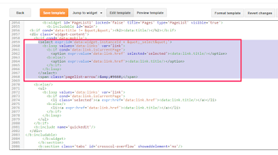
==> Go to "Template" > 'Edit HTML' and search for <b:widget id='PageList1'. Alternatively, you can use the "Jump To Template" option to easily navigate to the PageList1 widget code.
==> Scroll down and look for the following codes :
<select expr:id='data:widget.instanceId + "_select"'>
<b:loop values='data:links' var='link'>
<b:if cond='data:link.isCurrentPage'>
<option expr:value='data:link.href' selected='selected'><data:link.title/></option>
<b:else/>
<option expr:value='data:link.href'><data:link.title/></option>
</b:if>
</b:loop>
</select>
<span class='pagelist-arrow'>&#9660;</span>
<div align='center' class='tabs-outer'>
<strong>
<b:loop values='data:links' var='link'>
<span> <a expr:href='data:link.href'><data:link.title/></a> </span>
<!--separator-->
</b:loop>
</strong>
</div>
<div class='clear'/>
What's your take on this?.
This has really made it difficult sometimes for visitors to find your contact page, except they scroll down to the footer if you have added the contact link there.
Google Adsense is another important thing to consider, placing ads below a drop down navigation is a violation of Adsense policy. Therefore, of recent many ads below that spot on blogger mobile view were force to the bottom.
Well, you can eliminate the drop down pagelist on mobile view and let it display the same way it appears on webview. This tutorial will guide you on how to do so.


How To Get Started
Before you get started, please, BACK UP YOUR TEMPLATE so you can easily reverse should in case you mess up your blog's code.
==> Go to "Template" > 'Edit HTML' and search for <b:widget id='PageList1'. Alternatively, you can use the "Jump To Template" option to easily navigate to the PageList1 widget code.
==> Scroll down and look for the following codes :
<select expr:id='data:widget.instanceId + "_select"'>
<b:loop values='data:links' var='link'>
<b:if cond='data:link.isCurrentPage'>
<option expr:value='data:link.href' selected='selected'><data:link.title/></option>
<b:else/>
<option expr:value='data:link.href'><data:link.title/></option>
</b:if>
</b:loop>
</select>
<span class='pagelist-arrow'>&#9660;</span>

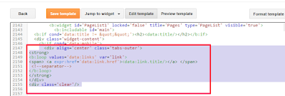
==> Once you find the above codes, replace them with the codes below:
<div align='center' class='tabs-outer'>
<strong>
<b:loop values='data:links' var='link'>
<span> <a expr:href='data:link.href'><data:link.title/></a> </span>
<!--separator-->
</b:loop>
</strong>
</div>
<div class='clear'/>

==> Click "Save Template"
==> Go to "Template" > "Customize" > "Advanced" > "Add CSS"
==> Copy and paste the code below, in the "Add CSS" box
.mobile .tabs-outer {
color: #333;
text-align:center;
width:auto;
overflow:hidden;
margin:0;
padding:0px 0px 0px 0px;
}
.mobile .tabs-outer span a {
color: #fff;
padding:0 7px;
margin:0;
}
.mobile .tabs-outer span a:hover {
text-decoration:none;
color: #fff;
font-size:1.0em;
padding:0 5px;
margin:0;
}
==> Click "Apply To Blog"
That's all.
View your blog on mobile and you should see that the dropdown menu displaying as it does on web view.


0 comments:
Post a Comment